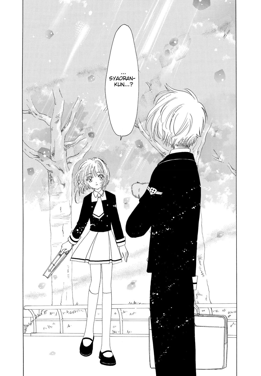
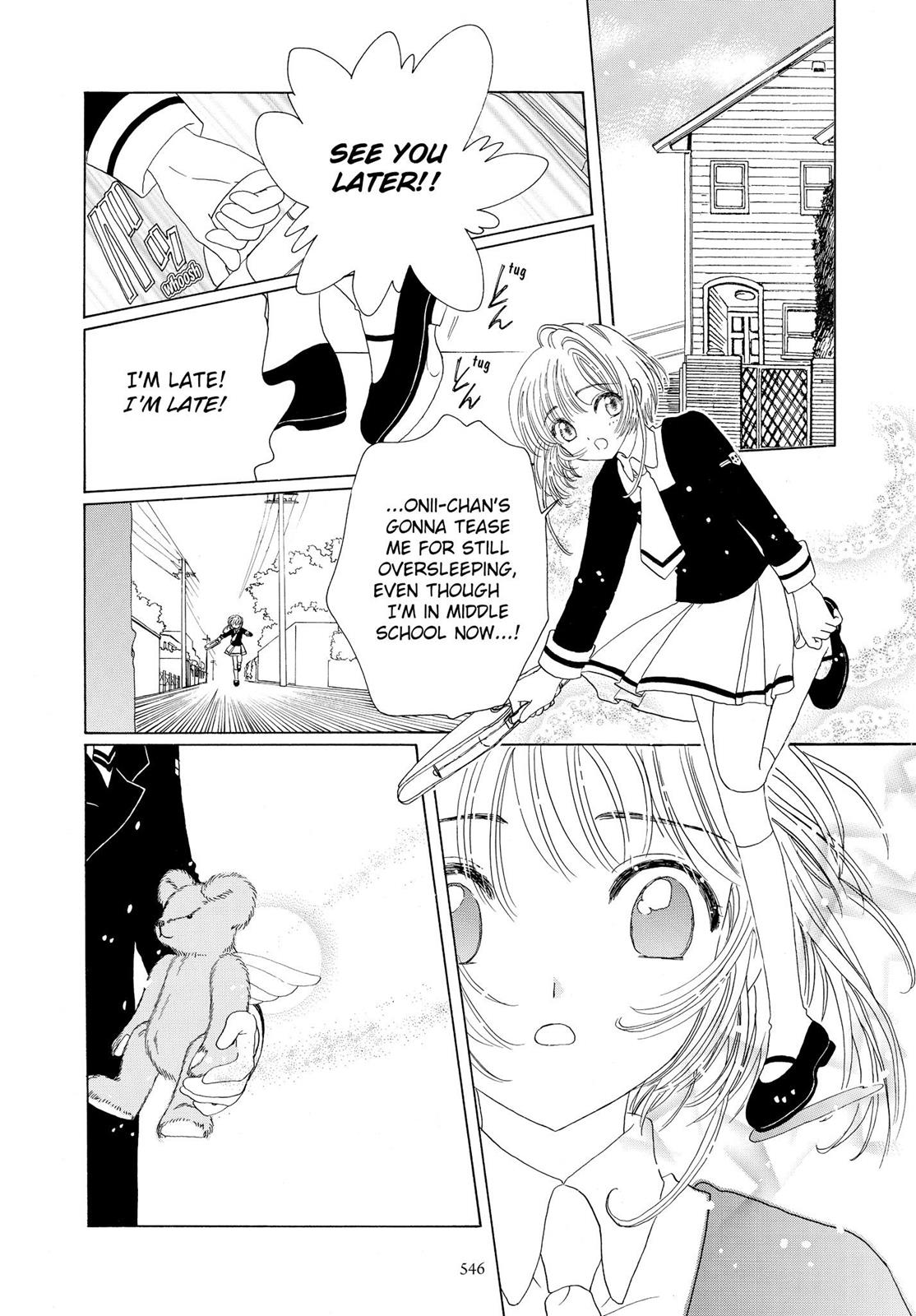
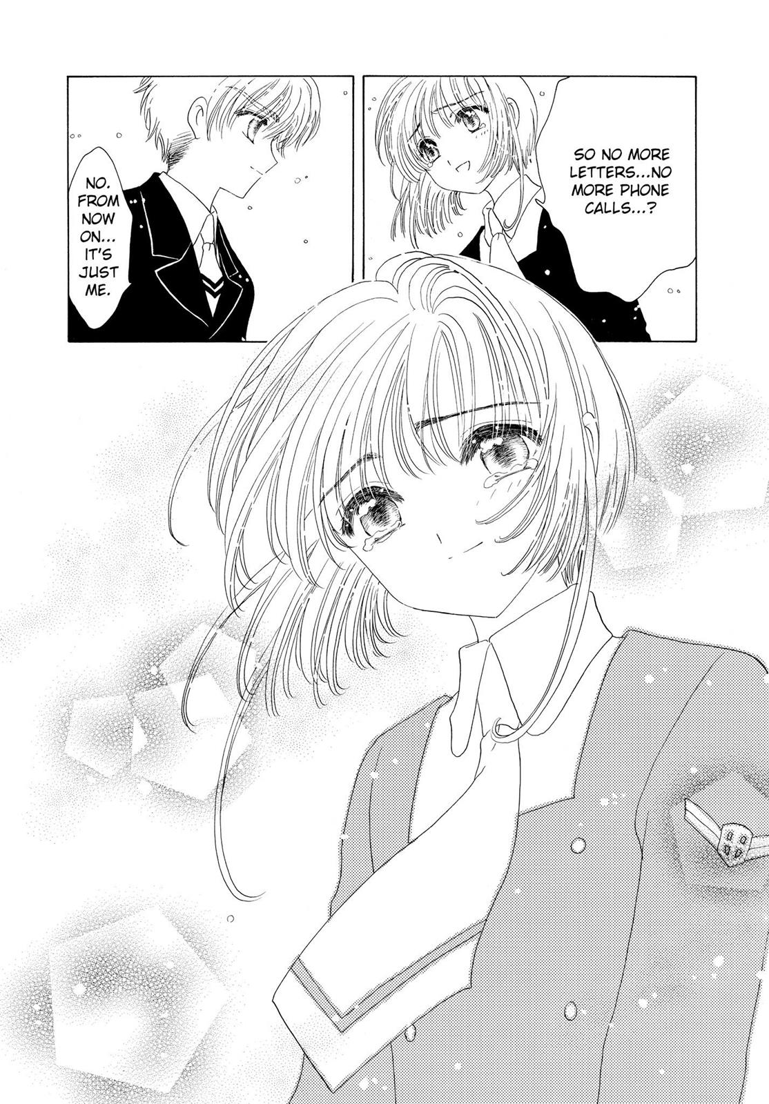
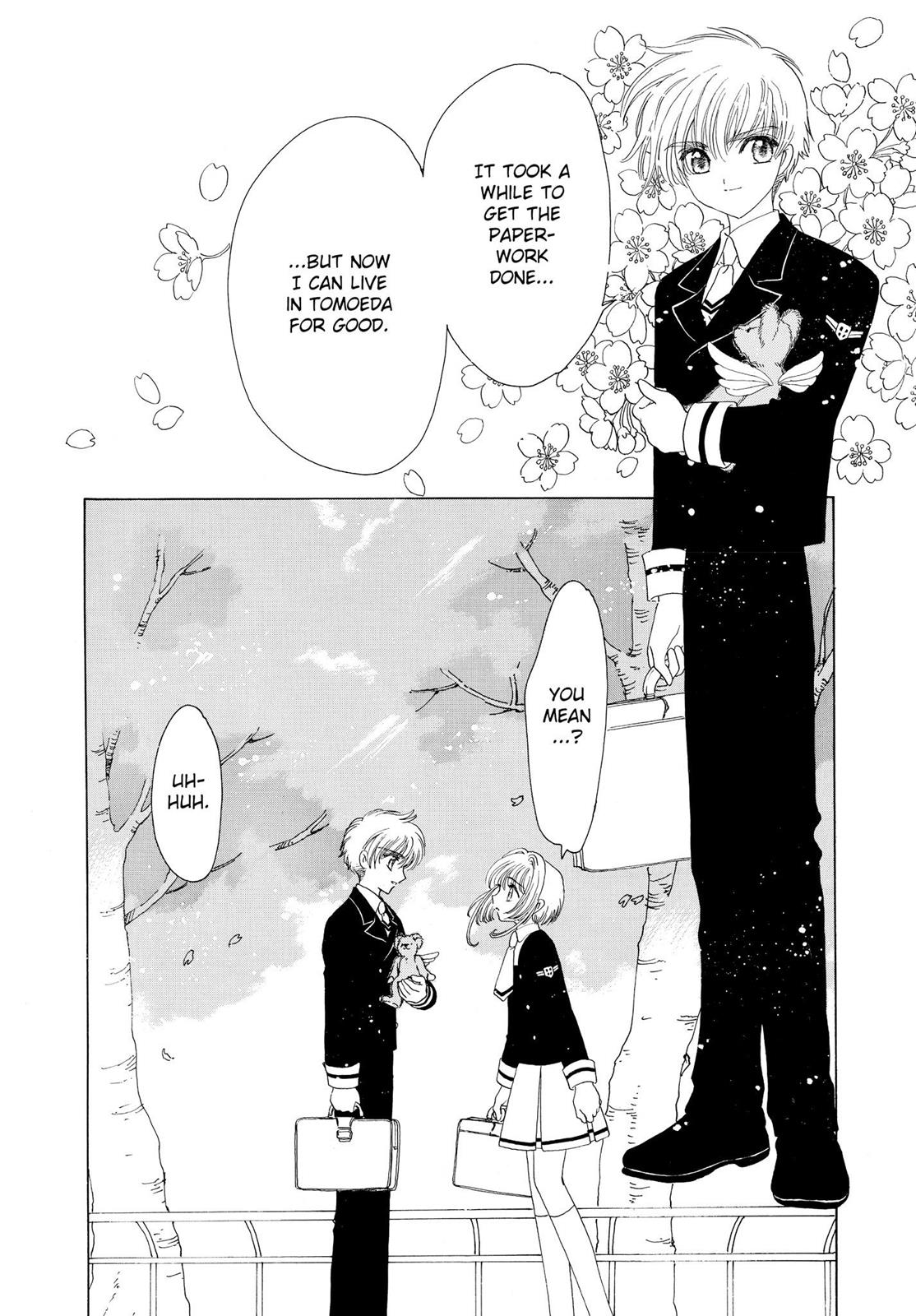
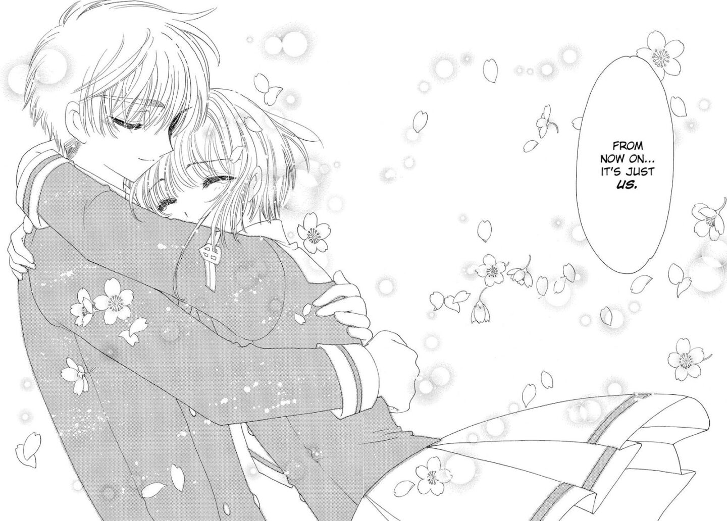
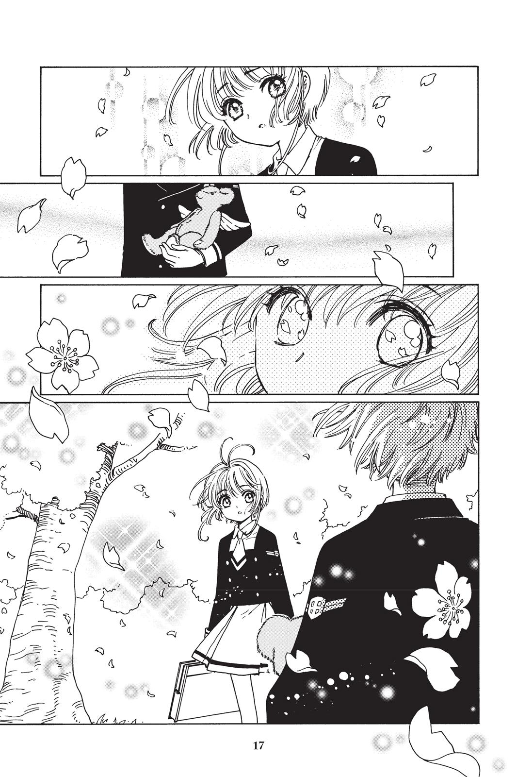
Okay first thing’s first: I just finished reading the entire Cardcaptor Sakura manga (original) and despite the issues I have with the romantic relationships, I still loved it. Mostly, I loved the artwork. It is stunning. The lines are soft, and the eyes are always drawn with such gentle care showing vast emotion.
I cannot say the same for the Clear Card artwork.
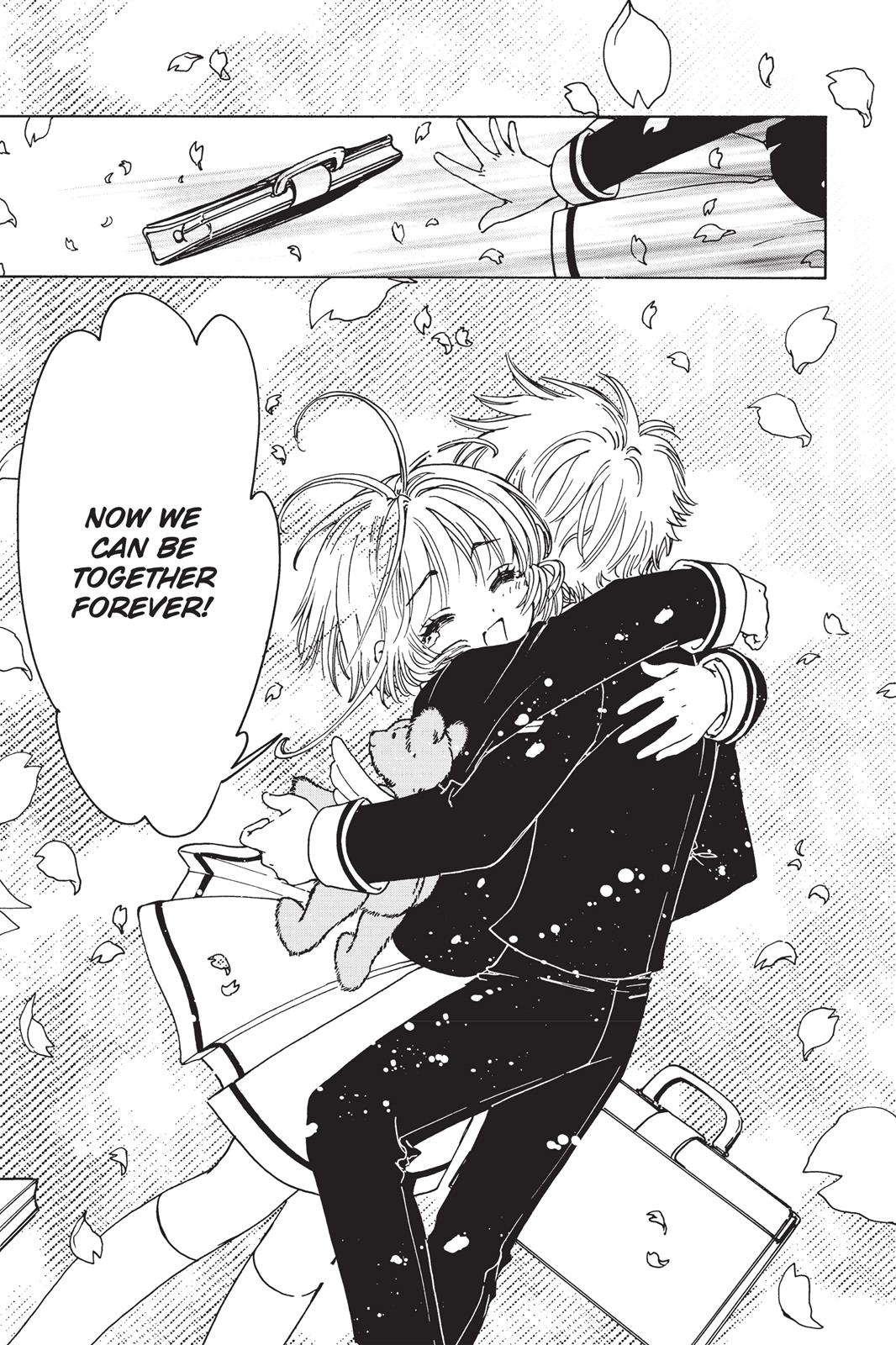
It’s a shame because I feel like the artwork for the anime has improved greatly, so why is it that it’s like the manga artwork has taken three steps back? I can’t stand Sakura’s 3 giant lashes, and the gently layered lines from the OG series has been replaced with harsh, thick ink.
Actually that’s my overall complaint for their artwork. Everything is thicker, plainer… Like their art medium went from HB-2B pencils to a single 1.0 gel pen.
Where did all the detail go? The soft backgrounds, the realistic flowers, the gentle shading… Right now it’s putting me off so badly that I almost don’t want to keep reading, but I do love CCS so I will force myself to continue because I am curious to know what happens next.
The start of Clear Card is basically the same as the ending of the OG series, and if you just compare the two artwork side by side… whoever drew Sakura back in the day made her look older, more mature, but also with the same beautiful, delicate art style. The new one looks a bit… comical, and reminds me of the artwork of a different shoujo manga I forgot the name of but also did not like the art for (so I dropped it).
And how did Yukito end up looking even younger in the Clear Card arc than the original series? And Yue now looks like a 10yr old boy, nothing like his majestic self from before. He looks like a permanent chibi version of himself, and I do not mean that in an endearing way. Part of his greatest charm in the original was when he would break away from his pensive, cool expressions to show a more animated side of himself… but now he looks like a permanent caricature.
Speaking of chibi forms, you can barely tell their chibi and non-chibi forms apart because there’s just so little extra effort in the regular art anyway. In fact, you know what? Somehow everyone looks younger after “ageing” 2 years.
Seriously, CLAMP, what? I know they have gone through artist changes so… I dunno… I’m just disappointed.
Here, I’ll just show you (read right -> left):
Heads up: this is an ending spoiler for Cardcaptor Sakura, though it is also the start of the Clear Card series and was published 20yrs ago, so I’m not sure it can be considered much of a spoiler anymore. But here’s your warning anyway.
Original (All artwork by CLAMP)
Clear Card
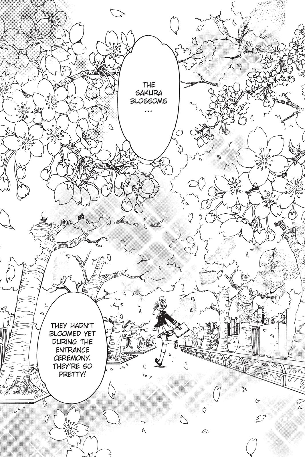
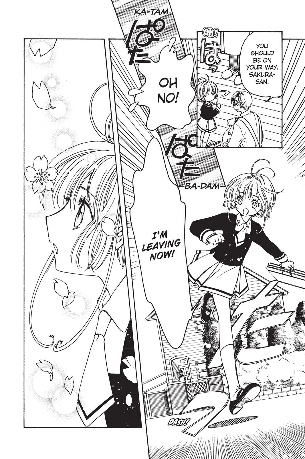
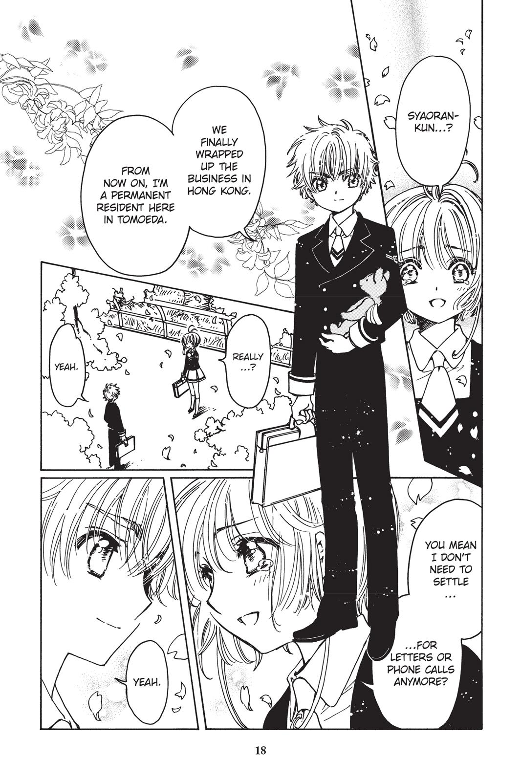
…You see?? I just… Bleh :(
To me, it feels like whoever took over drawing CCS is an amateur artist who is incapable of capturing the essence of emotions and beauty that the original CCS series conveyed. I hope they can improve over time, otherwise, I may just drop the manga and only watch the anime instead.
And there’s something I never thought I’d say!
/rant