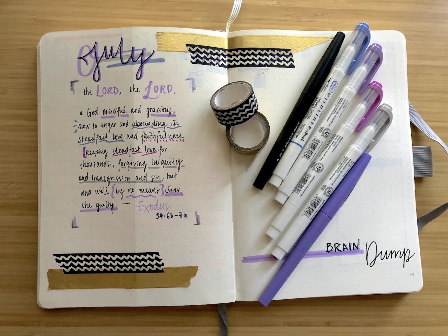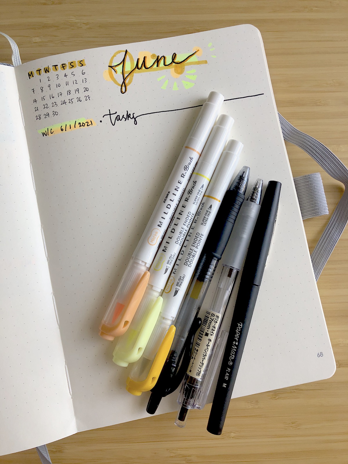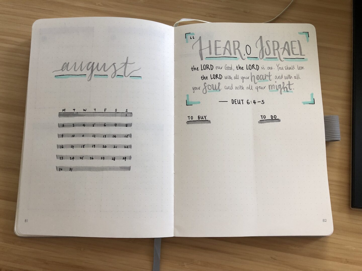
This is the first month I decided to do a clean title page + calendar. I also thought the verse would take up a lot more space than it did, so after it barely took up half of the page I decided to add a monthly to-buy and to-do list at the bottom.
I really like the clean aesthetic and am incredibly pleased with how the colours worked together. Those were not planned, I kinda wanted to go with grey to match the colour of my walls haha and somehow the mint just popped perfectly. I really like this look; no wonder bullet journalists use it so much…
The centred calendar + ‘august’ with all that negative space gives it so much breathing space. I feel at peace when I look at it and it brings me so much joy. I think I’d definitely like to continue doing a page like this for the following months too, and next time I’ll better plan out the spacing with the verse.
I’ve gone back to the rolling weekly task list for now. I realised I wasn’t really using the daily boxes apart from a few select days like returning-keys day or IKEA-trip day, and the rest of the time I had felt a little paralysed or too exhausted to do anything beyond surviving my day-to-day tasks.
Read More